grid
A simple guide to responsive design.
Made by Adam Kaplan.

A simple guide to responsive design.
Made by Adam Kaplan.
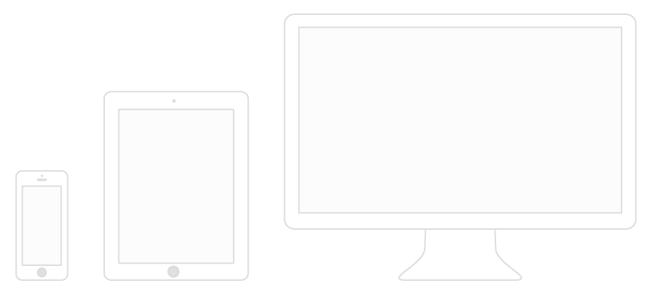
We want our websites to be useable on all devices by responding to the user’s behavior, screen size and screen orientation.
As of 2013, there are thousands of different devices and screen sizes that browse the internet, so it’s impossible to design layouts to target them all. Instead, we must take a more fluid approach to design.
The term “mobile first” gets thrown around a lot lately. What it really means is to start with mobile styles and layer on styles optimized for larger screens only as needed. In other words, your mobile styles become the default and you no longer have to override them later. It’s much simpler!
By assuming a flexible but simple layout by default, you can better guard against browsers—with viewports wide and small—that aren’t quite capable of the full responsive layout. So when we’re talking about layout, “mobile first” really means “progressive enhancement.”
—Ethan Marcotte

Introduce layout-specific rules only when you need them. Use min-width to layer complexity on your
layout as the viewport widens. It’s easier to have all the media queries nearby, rather than at the end
of the stylesheet or in a separate document.
Browsers will render your CSS differently. To avoid this, it’s a good idea to use a modern alternative to a reset like Normalize.css, which will render elements more consistently cross-browser. Remember to include it as-is before your stylesheet.
Place in the <head> of your HTML. This enables use of media queries for cross-device layouts.
It’s important to understand the basics, like how elements are generated and behave in the browser, before diving into responsive web design. The CSS Box Model consists of four distinct parts.
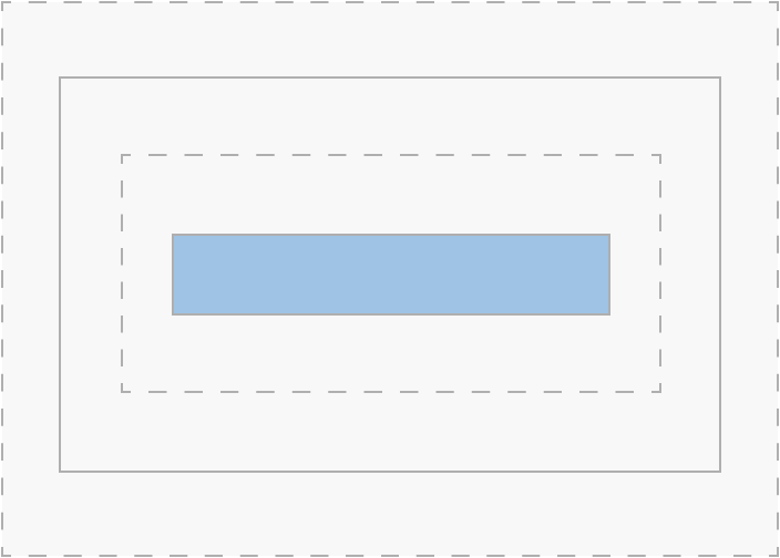
The content of the box, where text and images appear.
Clears an area around the content.
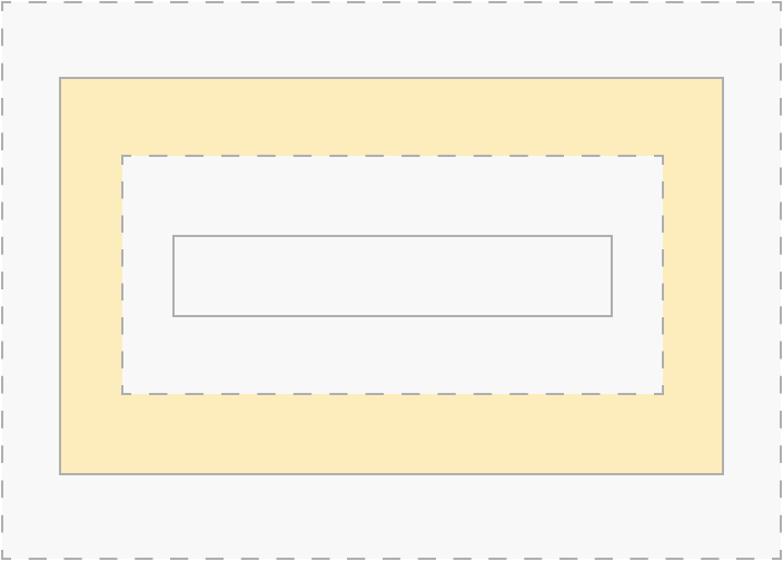
A border that goes around the padding.
Clears an area around the border.
Place at the top of your CSS file. The * will target all elements on the page.
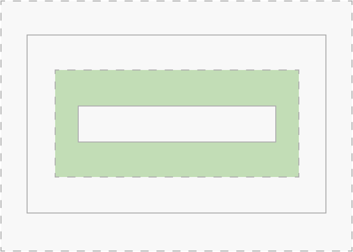
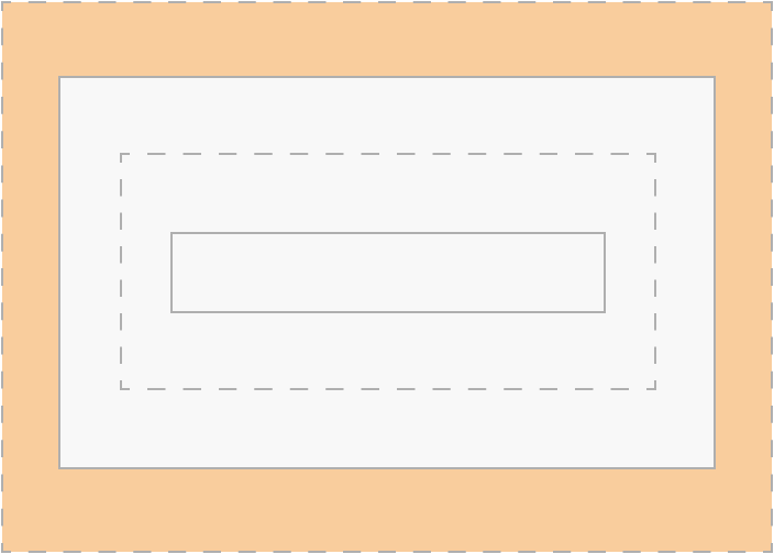
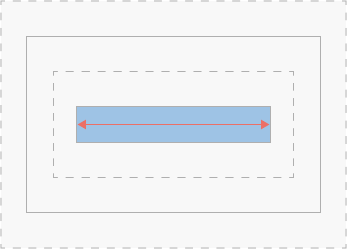
What was once a bug is now a widely used CSS property. It basically means you can choose whether or not to include borders and padding in the width of your content.
Margin, borders and padding are drawn outside the set width of your content.
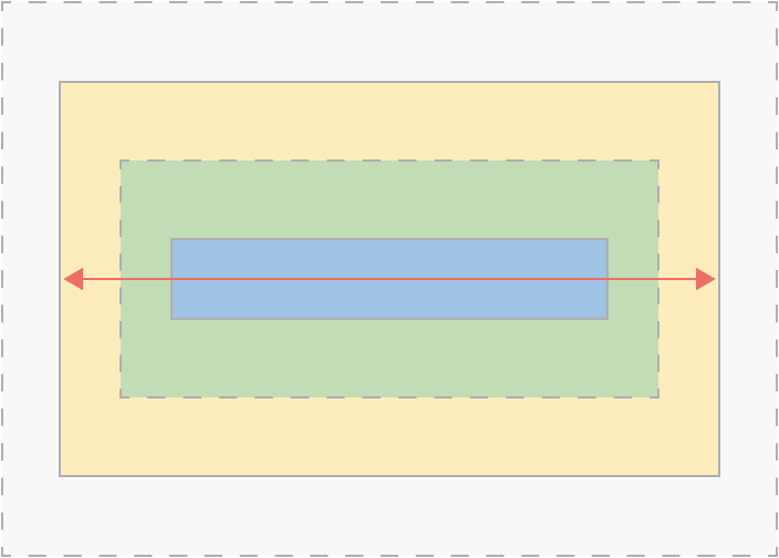
Borders and padding are drawn inside the set width of your content. The margin is drawn outside.
A container holds all elements and controls the page’s maximum width. Using a container will make designing for responsive easier!
With mobile first, columns are block level (takes up the full width available) by default. No
additional styles needed!
On larger screens, columns gain float: left in order to stack content horizontally. Columns now
use padding for gutters, so you no longer need to worry about removing margins.
Columns are wrapped in rows to prevent other elements from stacking next to them, otherwise known as clearing
issues. Rows are cleared using the popular clearfix, which was created by
Nicolas Gallagher.
Add the class .flow-opposite to columns where you want content to display first on mobile but
appear on the right on larger screens.
By following these simple steps, you are on the path to responsive web design mastery. Keep practicing and help make the web a better, more useable place.